Editing Menu
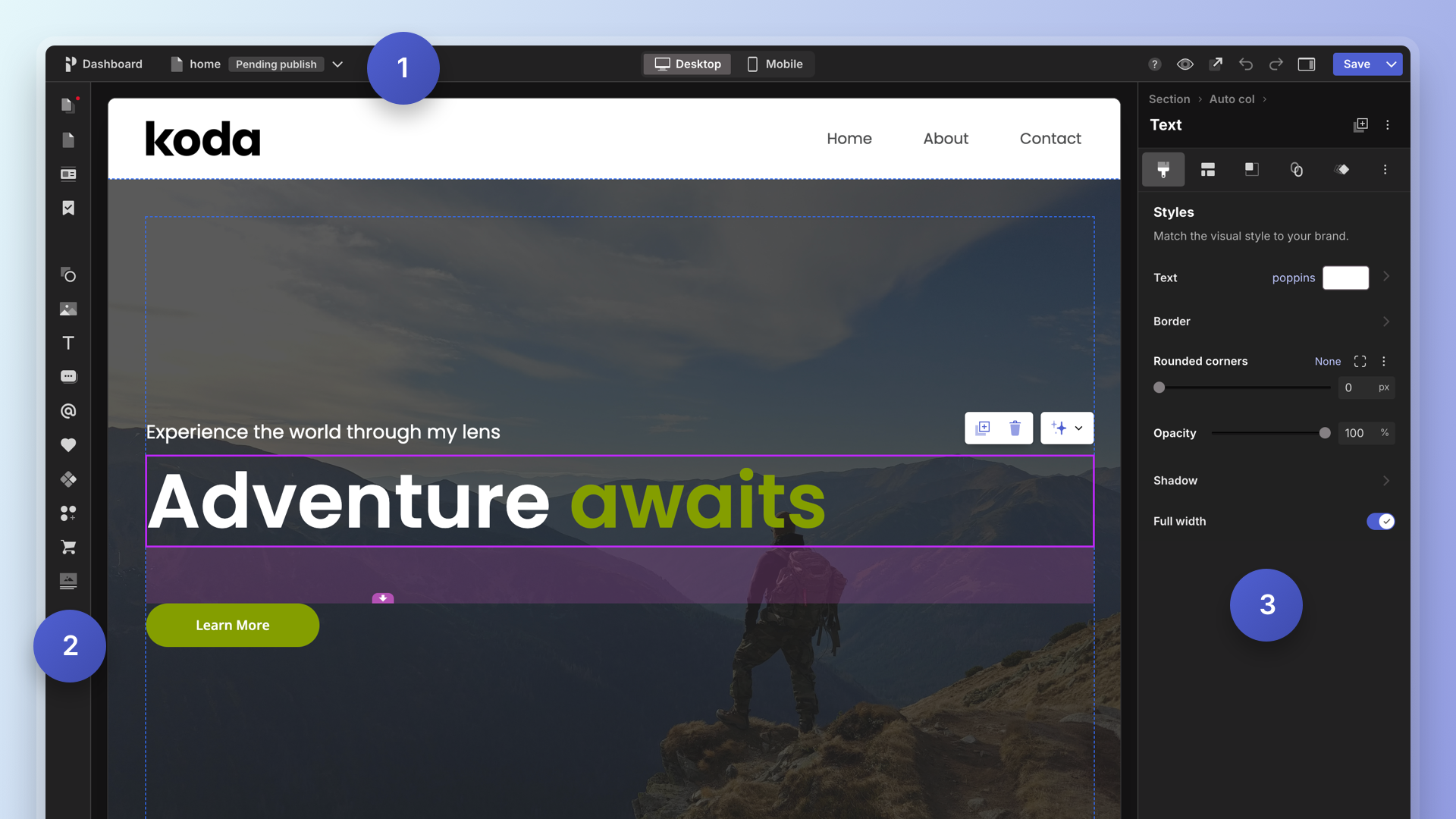
The Editing menu, pictured below (3), is the left sidebar that provides you with the controls you need to edit and style whatever you have selected. The Editing Menu is your primary tool for updating and applying styles, position, layout, animations and more.
Getting to know the Editing Menu
The Editing Menu is always fixed to the right side of your canvas so you always have easy access to styling and layout controls.
The Editing Menu has 3 areas:
- Header: Here you can find the breadcrumb, the type of object you have selected (Text, Button, Section, etc) and some actions like duplicate and delete.
- Top bar (tabs): These are the categories of controls like Style, Size and position, Layout, and more that you can use to update your selection.
- Controls: Displays the controls for the active tab.
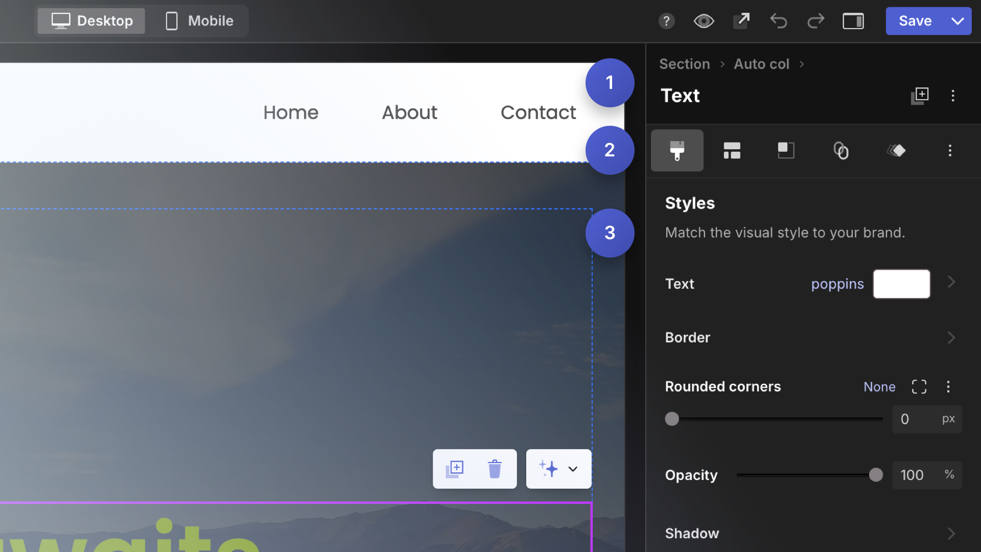
Editing Menu Header
The Editing Menu Header lets you know the type of object you have selected and where it’s located in within the Section hierarchy.
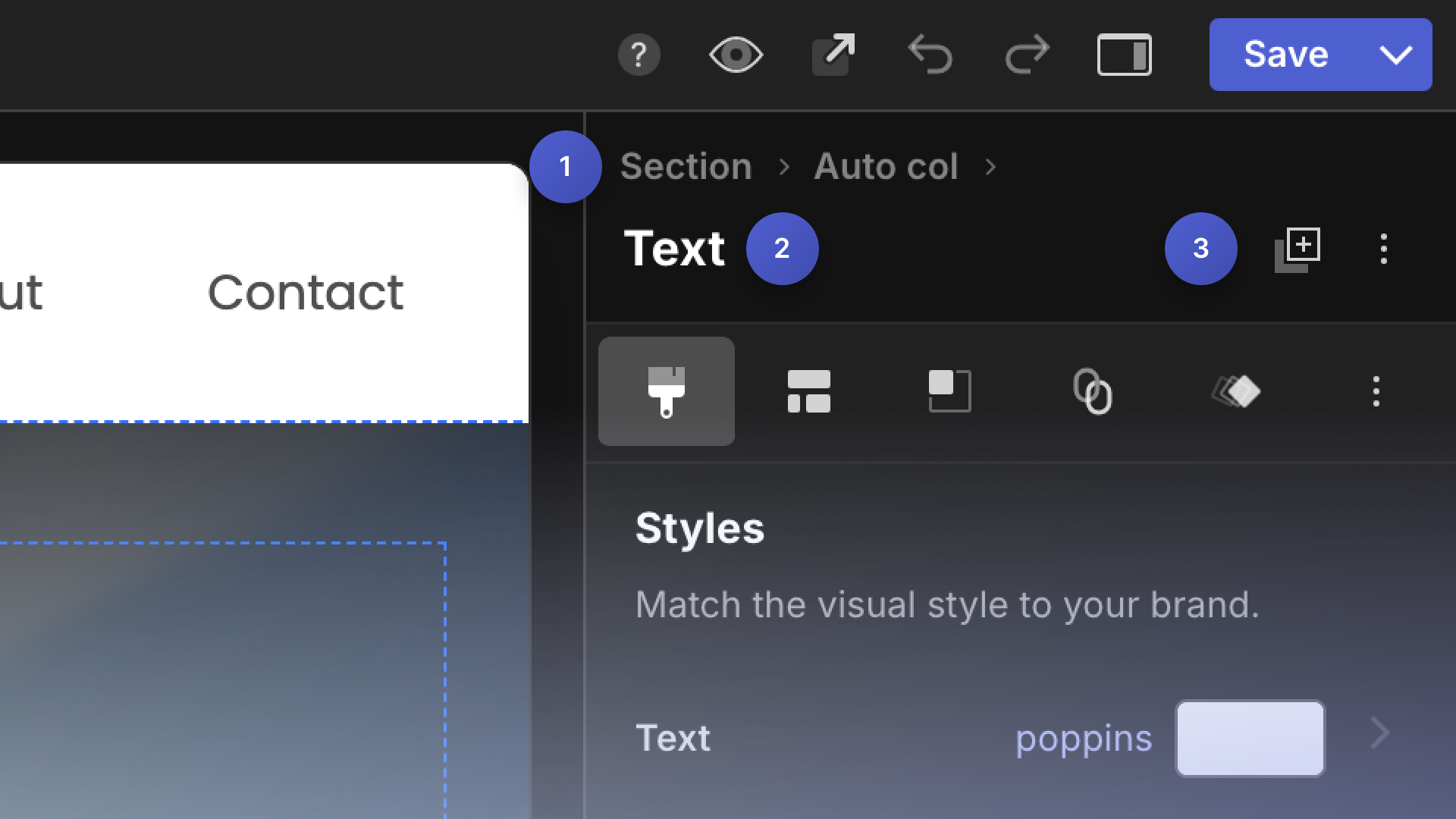
Breadcrumb (1)
The breadcrumb (1) shows you where your selected object lives within the hierarchy of the Section. A Pagecloud page is built out of Sections. Inside the Section are Columns (minimum 1, maximum 4). Inside a Column lives all your content (text, images, buttons, etc.) The breadcrumb shows you what layers are under your selection. For example, if you have selected a text box (as seen above), the breadcrumb displays a Column, and then a Section. You can use the breadcrumb to easily select the Column or Section to start editing that layer.
Here are a few more examples:
Let’s say you have an image selected that is within a Column. The breadcrumb would be as follows:
Section > Column >
Lets consider a more complex layout where you may have an image selected that is contained within a Gallery. The breadcrumb would be as follows:
Section > Column > Gallery >
Tip: Clicking on Gallery would allow you to select the Gallery object and edit gallery settings.
There are a variety of object types in Pagecloud that act as containers (Galleries, Layouts, Forms and more), each of those types will show up in the breadcrumb as you select objects within them. This helps you know the object lives and gives you an easy way to select the parent containers.
If a Section is selected no breadcrumb is displayed.
Selection type (2)
The type of object that has been selected will be displayed below the Breadcrumb.
If you have multiple objects selected you may see;
- Text (3) - This means you have 3 text objects selected
- Mixed selection (3) - This means you have at least 2 different types of objects selected
Actions (3)
To the right of the Selection type are a couple of icons. The first is a Duplicate action, clicking this will duplicate the current selection. The next icon is three dots, this represents a menu. Clicking this menu icon will provide you with more helpful actions to you can perform on the current selection. You can always find Delete at the bottom of that menu.
Editing Menu Tabs
The Editing Menu has a toolbar of icons just under the selection type. These are the various categories of controls that you can use to edit your selected object.
The following are some of the common tabs. Some complex objects like Galleries, Forms, Sections, and Columns have some additional tabs.
Style
The “Style” tab provides controls to change the appearance of the selected object(s). Tip: you can select more than one object at a time and style them together.
Controls can include:
- Color
- Gradient
- Border
- Rounded corners
- Shadow
- Opacity
- Full width toggle. When on, Full width will make the selected object span the width of the column.
Layout
The Layout tab has controls that allow you to control the arrangement of objects within. The contents of the Layout is different based on the type of object selected.
Section. Within the layout tab you can add and manage columns, width and height settings and apply padding to the section.
Column. Within the layout tab you can switch a column between Auto and Manual, and in the case of Auto columns set Content Alignment and Padding.
Object(s). With the Layout tab you can apply an Auto Layout to the selected objects. This will arrange the objects within a Horizontal or Vertical layout. Learn more about Layouts.
Auto Layout. With the Layout tab you can adjust layout settings for the selected layout. These include alignment, wrapping, gap, padding and more,
Size and Position
The “Size and Position” tab gives you control over the size, placement, and visibility of an object. The controls in Size and Position change based on whether or not the parent column is Manual or Auto.
Within the Size and Position you can expect controls that will allow you to do the following.
- Sort (Auto only)
- Move (Manual only)
- Distribute (Manual only)
- Position (Manual only)
- Adjust the size of an object
- Rotate an object (Manual column)
- Create space below an object (Auto only)
- Create a manual group of objects (Manual column)
- Lock objects in place
- Hide objects
Learn more about the Size and Position tab
Link
The “Link” tab allows you to create a link to one of your pages or link to another website.
You can create a link to the following:
- Another Pagecloud page
- A section on a page
- An email
- Another website
- A phone number
- A video Lightbox
Tip: if an object has a link a red dot will display beside the link icon.
Animation
Apply and edit entrance and attention seeking animations to current selection.
Tip: if an object has a animation a red dot will display beside the link icon.
Settings (Gear icon)
Some objects have some additional settings that are unique to that object type. These are contained within the Settings tab.
Video. Adjust the video controls that are visible as well as adding effects to your video.
Image. Add accessibly and SEO alt text, adjust image display properties, add effects.
Advanced (Menu icon)
The “Advanced” tab provides you with some powerful features that may require some additional expertise.
You can find the following controls in Advanced:
- CSS Selectors. Apply custom CSS ID and Classes to the selection.
- Data attributes. Add extra information like Aria accessibility attributes.
- Script editor. Open a script editor for the selected object allowing you to add javascript to be triggered on events.
- Reset Mobile styles. Allows you to clear any styles overrides applied to the selection in the mobile view.
Placement
The Editing Menu stays fixed to the right side of your Canvas. You can hide the Editing Menu (and entire UI) by pressing the H key. Press the H key again to show the UI.