Add and style components
Components are prebuilt complex objects that you can add to your page. They may contain additional functionality and/or structure content to maximize compatibility and accessibility. In short, they save you time.
The following are the types of components that have been added to Pagecloud. If you would like additional components please reach out to our support team with your request.
Types of components
FAQ
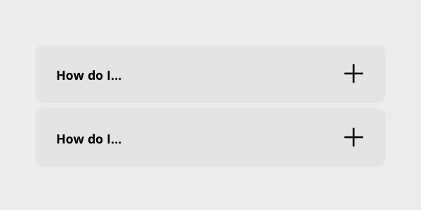
An FAQ (Frequently Asked Question) allows you to present a single or list of questions and answers for your visitors. The component can be expanded and collapsed allowing you fit several on your page without taking up too much space. These have been created to be be search friendly and accessible.
There are two components, one is an individual FAQ and the other is a list of FAQs.
Each FAQ item has a place for a question and an answer. You can use the icon to open and close the item.
To add more FAQ items
- Select the inner FAQ item and use the duplicate control in the control strip to create a duplicate, or
- Select the FAQ component and use the Add control in the control strip
Replace the icon
- Select the icon(s) you want to replace and click Replace in the control strip.
- The left drawer will open. Open Icons -> Expand and collapse category to see a list of appropriate list of expand and collapse icons. Choose the one that matches your style.
- Be sure to replace both the expanded and collapsed versions so their style matches.
Sort FAQs
If you are using the FAQ list you can sort FAQ items by dragging and dropping them within the list.
Warning: FAQ components rely on Auto Layout features. Using an FAQ component in a Manual column may result in your content below being obstructed by the FAQ when toggled open.
List
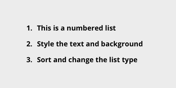
A List allows you to present a simple, structured list of content for your visitors. You can choose the list style you want to have, format the text and adjust the spacing. These have been created to be be search friendly and accessible.
There are two example list components, one is a numbered list and the other is a bullet list.
To add more List items
- Select the List item and use the Duplicate control in the control strip to create a duplicate, or
- Select the List component and use the Add control in the control strip
Sort list items
Select a list item and drag it within the list to sort it.
Change the list type
- Select the List component. Tip: if you have the List item selected you can use the Breadcrumb in the Editing menu to select the List
- In the Editing menu select the Style tab
- The first control in the style tab allows you to choose the list format
You can choose from the following list formats:
- A filled circle
- A hollow circle
- A filled square
- Decimal numbers, beginning with 1
- Lowercase letters (Latin)
- Uppercase letters (Latin)
- Han decimal numbers
- Decimal numbers, with a leading zero
- Lowercase roman numerals
- Uppercase roman numerals
- Lowercase classical Greek
Images with captions (Figure)
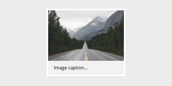
Sometimes you want to include a caption with your image and have is directly associated with the image. This component is structured as a Figure providing the proper semantic structure to associate your image and caption together. These have been created to be be search friendly and accessible.
There are thee variations of the Image with caption component to provide you some options.
Image with caption
Position the caption
The caption can be positioned above or below the image. To change it’s position you can:
- Select the caption and drag it to the top or bottom of the image
- Select the caption and use the Arrange -> Move controls in the Editing menu
Image with caption overlay
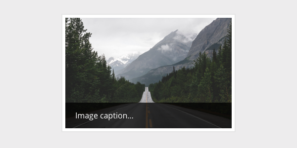
The caption is overlayed on top of the bottom of the image.
Image with full cover caption overlay
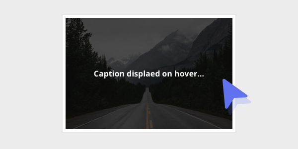
The caption is overlayed on top of the entire image and is set to display on hover using the Animation settings (which you can edit!).
Position the caption
The caption can be positioned to the top, middle or bottom. To change it’s position you can:
- Select the caption and use the Arrange -> Move controls in the Editing menu
How to add components
Components can be found in the left sidebar inside the menu item ‘Components’.
To add a component to the page, click and drag the component you want from the sidebar onto your page.
Tips for styling components
Components are built from Pagecloud objects and use the same styling controls you are already used to. Here are a few tips.
- Components can’t be ungrouped.
- Components have a an overall wrapper that contains the objects within. This wrapper supports a background color, padding and other styling options.
- The breadcrumb in the editing menu can be helpful for selecting the component wrapper.
- Some components can support many items in a list format.