Getting started with Pagecloud Popups
You can add a popup or banner to your web pages using Pagecloud Popups! Popups are a great way to bring value to your customers, collect leads, and improve conversion rates on your website. Explore the full Pagecloud Popups feature or browse popup and banner templates.
What are Popups and Banners?
Popups and banners are lead capture and marketing tools for your website. They can drive email signups, alert important information, and bring your website visitors more value.
Popups: Pagecloud popups can have many styles, but in general are vertical aligned and have more space for text, forms, images, and more. Popups can be positioned to the right, left, or centre of the page.
Banners: Banners are horizontally aligned and are positioned at the top or the bottom of your web page.

Types of Popups
There are many types of popups you can choose from depending on your needs. Here are a few examples of popups and banners templates that you can include on your website:
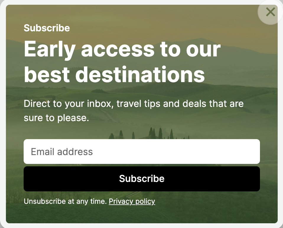
Offer: Alert your customers about discounts or promotions you are running on your website
Welcome: Greet your customers with a discount or special offer.
New content: Show your customers the latest from your website.
Lead capture: Encourage your users to sign up to subscribe or be notified
Help and resources: Offer important information to visitors on your site
There are so many ways you can use popups and banners on your website to enhance your users’ experience and increase your conversions.
Create a new Popup or banner
You can create a new popup or banner for your website in the project dashboard.
- From your workspace dashboard, select the existing project (site) where you would like to add a popup. Or create a new project.
- From the left toolbar, click Banners and Popups
- Click Create new and select From template (or you can duplicate an existing popup or banner)
Now you can begin to setup and design your popup or banner.
Setup
Setup is where you can update details like the name, as well as when, where and how you want to display your popup or banner.
Step 1: Name
Name your popup and give it a description so you are always know which popup or working with you are working with.
Click Update to save your changes.
Step 2: When to Display
This is where you can configure when you want your popup or banner to display, how often, what devices to display on and more.
Triggers
Triggers are the different types of events that can happen as the visitor is loading and viewing your page that you can use to display your popup. You can enable as many triggers as you want but only the first one that happens will show the popup.
On page load
On page load displays your popup or banner as soon as your page loads. The ‘On page load’ trigger also has an optional delay allowing you to display the banner a set number of seconds after the page loads. Remember to click update after making any adjustments.
Time delay
If you want to add a time delay to your popup or banner, toggle ON On page load, then enter the amount of seconds you want your user to be on the page before your popup appears.
Scroll position
Scroll position will display your popup as the user scrolls down your page and reaches the percentage of the page height set in the trigger. You can set the percentage of the page you want the user to scroll to before the popup appears (eg. 50%: once the user is halfway down the page, the popup will trigger)
Visitor is exiting a page (Exit intent)
Pagecloud can detect when a visitor is about to leave your website and allows you to proactively display a popup. You can use a popup like this to present your visitor an offer just before they leave to go somewhere else.
You can toggle ON both a time delay and a scroll position for your popup or banner. This means the popup will display once the user is on the page for x seconds OR once they have scrolled x percentage down the page.
Devices
You can choose to show your popup on both Desktop and Mobile devices or just one or the other. With this flexibility you can;
- have a different design for each type of device
- only show a popup or banner on the device type you choose
How often (frequency)
Define how often you want your popup or banner to be displayed to your visitors:
Every time
Popup or banner is displayed every time a visitor views the page.
Once per session
A Popup or banner will display once for each visitor session. The visitor session lasts as long as the life of the browser tab, once that tab has been closed the session expires and the visitor will see the popup or banner again if they revisit the page in a new browser tab.
Daily
Popup or banner will appear once per visitor in a 24 hour period.
Once per week
Popup or banner will only display once per visitor in a 7 day period.
Click Update to save your triggers
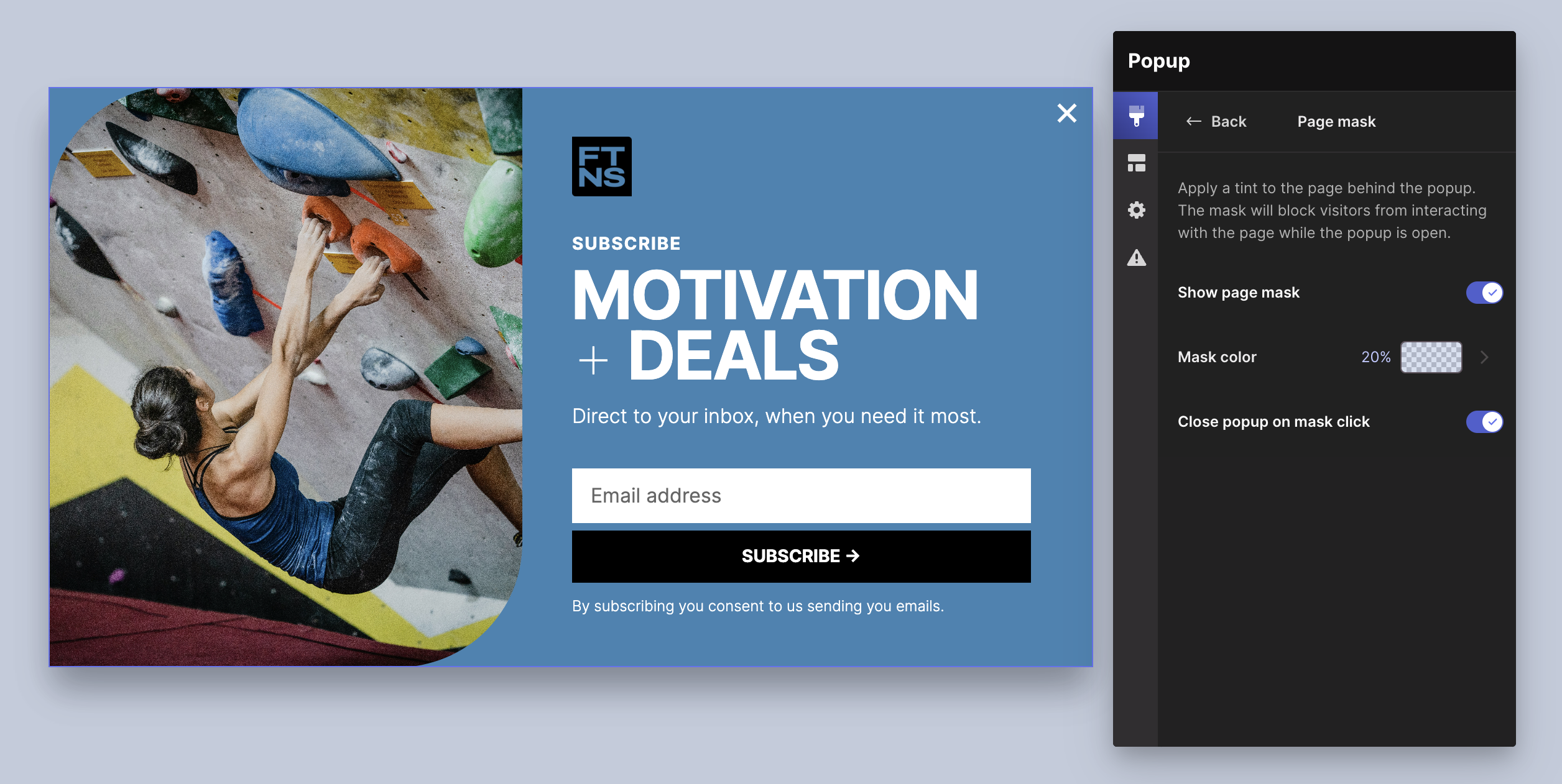
Page Mask
The Page mask covers the page outside of the popup. Often the mask has a tint to lighten or darken the page providing some contrast between the background and the popup. The Page mask also allows clicks on the mask to close the popup.
Close popup on mask click. When the Page mask is enabled it is possible to enable or disable the on the page mask to close the popup.
Here are a couple examples of when you may opt to enable or disable the Page mask:
- If you have a modal popup that displays in the middle of the browser viewport you probably want to have the Page mask enabled.
- If you have a small popup pinned to a corner of the browser viewport you may want to turn off the Page mask to allow visitors the ability to view and interact with the page while the popup remains open.
Step 3: Where to Display
Here you can choose what pages, or all of them, that you want your popup and banner to display on.
No pages
Select No pages if you don’t want to display your popup on any page (yet). This is selected by default.
All pages
All pages will display your popup on every page of your website.
Exclude pages
Exclude pages allows you to be specific about the pages you don’t want to display your popup on.
- Add pages to your excluded list by clicking the + Add pages button below.
- You can choose to select:
- Individual pages and blog posts
- Groups of pages. For example you may have several services pages that all begin with ‘services/’, in this case you can select ‘services/*’ and all pages within that virtual directory will be excluded.
- All blog posts
- Click Update to save your list
Your popup will display on every page of your website that is not in your excluded list.
Include pages
Use Include pages to create a list of pages where you want your popup to display.
- Add pages to your included list by clicking the + Add pages button below.
- You can choose to select:
- Individual pages and blog posts
- Groups of pages. For example you may have several services pages that all begin with ‘services/’, in this case you can select ‘services/*’ and all pages within that virtual directory will be included.
- All blog posts
- Click Update to save your list
Design
The fun starts when you get designing your popup or banner!
Choosing a template
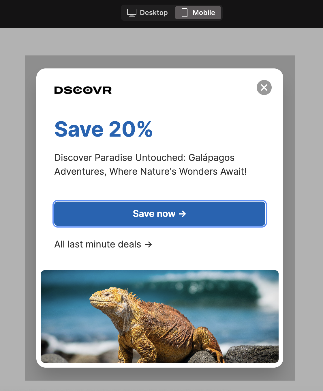
We have an awesome library of templates to choose from. All popup and banner templates are fully responsive and customizable. You can choose popup and banner templates for a variety of use cases including lead capture, promotion, and resources.
Responsive editing
Popups and banners are created in a responsive editor. This means you only need to design your popup once and it will look great on all screens.
You can use the responsive preview handle to test how your popup or banner will look at different sizes.
For Popups with multiple Columns, the Columns will stack in mobile view. Although at this time this won’t display in your editor, you can see this in your mobile preview:
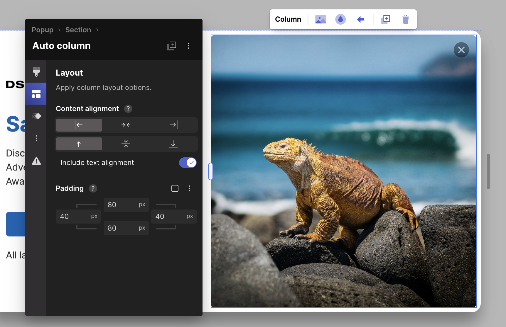
Use padding to display more or less of the background image of a Column. More padding will display more of the image:
Popup/Banner layout
In your Edit Menu you can adjust the layout of your popup and banner. The popup/banner layout refers to where it will display on your live web page.
Tip: Click on the background outside of your popup or banner to easily select it. You can also select the Popup using the breadcrumb in the Header of the Edit menu.
Position
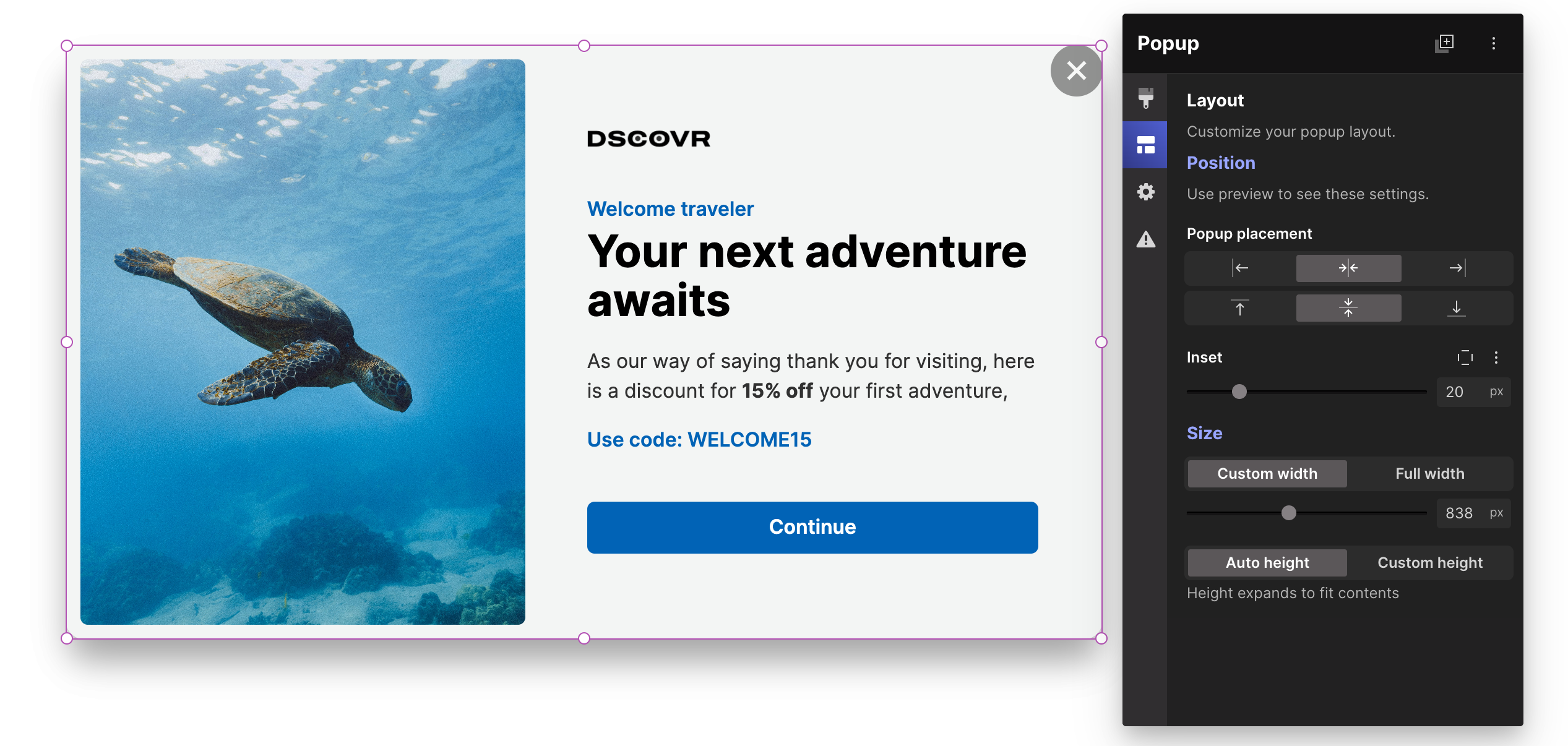
Popup placement
Use the arrows to customize where you want your popup to appear on your live web page.
Inset
Use the inset slider to add space between the edge of your web page and your popup. You can click Inset per side to customize the space on each side of your popup.
You will need to preview your popup or banner to view changes to the position
Size
Custom width
You can set width of your popup or banner so it won’t exceed your desired custom width on any screen size.
Full width
When enabled, Full width will extend the width of your popup to the full width of every device.
Full width has an additional control called ‘Constrain content width’, when enabled you can define a maximum width for the content within. The popup of banner background will continue to extend the full width. For example you may have a Popup that extends the full width of the browser but want your content to be limited to a specific width so it doesn’t look too stretched out.
Auto height
Your popup height automatically expands to fit the content and section heights.
Custom height
Sets a maximum height for your popup. The value is a percentage (%) of the height of the browser viewport.
Tip: if you want to have full height content in your popup you may also want to set the section within the popup to have a full height.
Styling your Popup
You can style your popup similarly to how you style objects and sections on your Pagecloud website! Click to edit text, replace images, and edit colours.
Page mask
The Page mask covers the page outside of the popup. Often the mask has a tint to lighten or darken the page providing some contrast between the background and the popup. The Page mask also allows clicks on the mask to close the popup.
To add or edit a Page mask:
- With the Popup selected select the Style tab on the left (the paintbrush).
- If there is no existing Page mask, click Add
With a Page mask enabled you have the following controls:
Show page mask
Toggle this off to remove the mask.
Mask color
Set the color and opacity of your mask.
Close popup on mask click
When enabled, if a visitor clicks on the page mask it will close the popup.
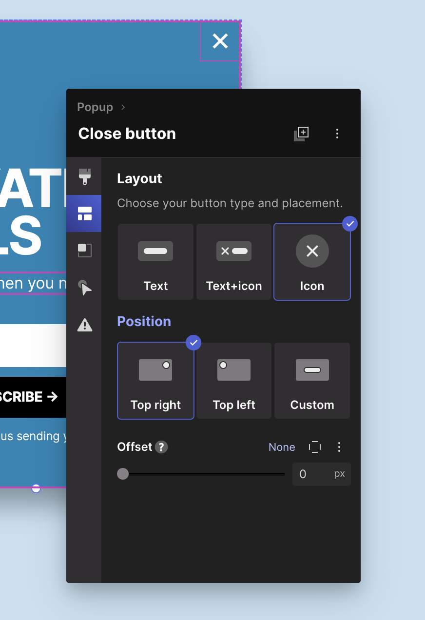
Close button
You can customize the close button for your popup to change the position, icon and style.
To select the close button select it on the canvas.
With the close button selected you can;
Button style
Select the Style tab (paintbrush) to change the color, add a border, corner radius, text formatting, shadow and more. As the close button is a button type object you can also edit the normal and on-hover styles to have a visual change when the visitors mouse is on top of the button.
Layout
In layout you can choose the type of button and adjust the position.
Button types:
- Text. This is a text only button. You can click on and edit the text.
- Text and icon. This button has both text and an icon. The icon is on the left and editable text on the right. This button type has an additional control called Gap, you can use that to adjust the space between the text and icon.
- Icon. This is an icon only button.
Position
-
Top left. The button will be positioned in the top left of the popup. You can offset the position using the Offset control.
- Top right. The button will be positioned in the top right of the popup. You can offset the position using the Offset control.
- Custom. The button will be moved to the content area of your popup and from there you move it to where you want it.
Edit the Icon
You can replace the close icon with another of your choosing and change the size of the icon as well. Start by selecting the icon on the canvas.
- Layout. Edit the height and width of your close button.
- Replace icon. Click the Replace Icon button and choose from the Button and Icons collections.