Over the years, the Pagecloud platform has evolved to suit the growing needs of the internet and our users. We want your Pagecloud site to be the best it can be, and help you succeed online!
If you have not re-designed or expanded your site in the past few years, and/or are looking for some tips and tricks on the best ways to use Pagecloud’s new features, continue reading to learn more!
Why else should you update your website?
- As world wide web evolves, it’s important to ensure your site stays up to date
- Users expect a certain level of usability and easy navigation
- A usable site on every screen: mobile compatible websites are a must!
- Easier to make updates and expand your site
Text updates
We’ve made updates to text editing to make it easier to manage text on your site. For an in depth guide into text editing, check out this article. Here are a few of our recommendations for updating text on your site:
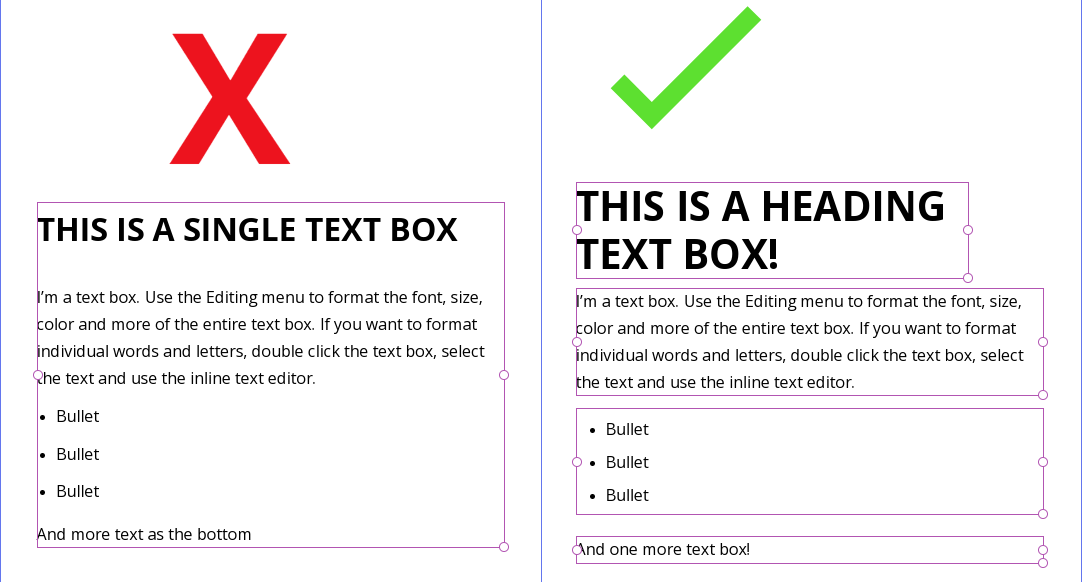
- Break out large text boxes into multiple text boxes
- Avoid placing text with different styles in the same text box. For example: Headings with a large font should be in their own box, while paragraphs should be in another box
- Bulleted or numbered text should be in their own box

Splitting up your text into different boxes makes formatting in both desktop and mobile easier.
Tip: To quickly break out a large text box into multiple text boxes, highlight the text and use your Copy shortcut (Command + c on Mac, Cntl + c on PC), click out of the current text box, and use your Paste shortcut to create a new text box (Command + v on Mac, Cntl + v on PC)
Sections
Sections are horizontal containers that allow you to break up your content into more manageable blocks.
The old Pagecloud way: A single, large “section” making up the body of your web page.
The new Pagecloud way: Build your page with multiple body Sections that are easier to manipulate, move, resize, and contain your content.
Check out our comprehensive guide to using Sections
How to get started with Sections:
- Click the + button on your page
- Add a new Section from a template or a blank Section
- Drag and drop your content into the new Section
Don’t see a + button? Your page may need to be updated to start using our new features! Send a message to support@pagecloud.com for help!
Why use Sections?
Sections make it easier to manage the content on your page, and expand your page. Sections can hold as much or as little content as you want, and you can adjust the height of each Section.
Set backgrounds: You can set colors or images as your Section backgrounds in order to overlay your content on top
Duplicate: You can duplicate entire Sections to quickly expand your site using the same style
Hide: Hide or Show Sections in desktop or mobile to customize
Our Section recommendations:
- Keep your content inside the Section margins
- Use Section Padding to create an even margin around your content
- Don’t add too much content into 1 Section, add another Section!
Site-wide Headers and Footers
You can add a header/footer that syncs across your whole site! A header/footer can be styled exactly like a regular Section, but will sync across your website. To add a header/footer:
- Open any editor page on your site
- Go to Sections in the left toolbar
- Click Add Header, or Add Footer
- Start designing!
Your header/footer will now sync site-wide.
Note: You can always hide your header/footer on pages where you do not want it to display
Columns
Now that you’ve split your page into Sections, you can break up those Sections into vertical containers known as Columns!
Columns allow you to have even move organization to your content. For an in depth look at everything you can do using Columns, check out this help article
Other recommendations for updating your page:
Upload Section and/or Column backgrounds: If you’re using a shape or image as a background, we recommend setting a Section or Column background instead. This means you don’t have to overlay so many objects on top of each other, and you backgrounds will flow more easily into a mobile view.